


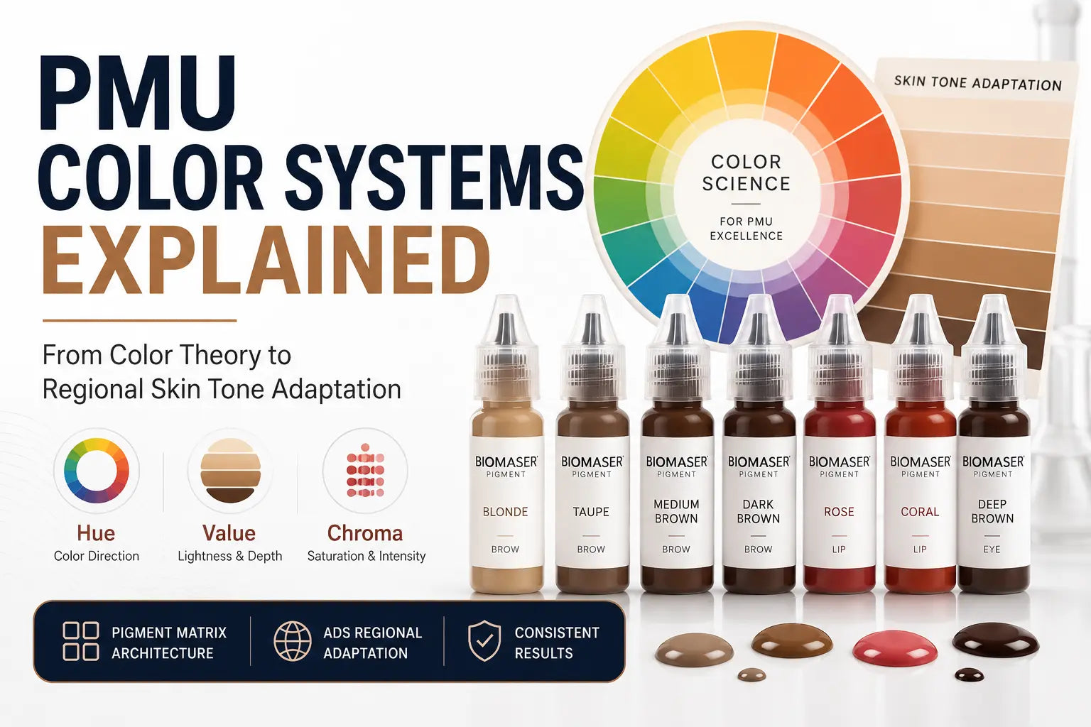
Classic PMU Color System Design: From Color Theory to Regional Market Adaptation
Introduction
Walk the floor of any major PMU industry trade show and you'll see the same marketing claim repeated across dozens of booths: "40 colors!" "50 colors!" "The most complete color range in the industry!" These numbers are designed to impress — they suggest comprehensiveness, choice, and professional capability.
The reality is more complicated. A professional color system is not a collection of colors — it's a structured engineering system with internal logic that determines how each color behaves, how colors interact with each other, and how the system serves the full range of professional workflows. A brand with 40 randomly selected colors has a large inventory, not a professional system. A brand with 20 colors organized according to systematic color science principles has a system — and it will serve professional work better than a larger but logically unstructured collection.
This article explains the complete framework for understanding PMU color system design: the color science foundations, the architecture of professional pigment matrices, the ADS regional adaptation methodology, and the practical evaluation criteria for determining whether a color system is actually professional or just large.
The Three Dimensions of Color: Hue, Value, and Chroma
Why These Three Dimensions Matter in PMU (and Not Just in Color Theory Textbooks)
Color science defines color using three independent dimensions:
Hue is the basic color identity — red, yellow, blue, and all the intermediate combinations. In PMU, hue determines the color direction: warm brown, cool ash blonde, warm coral, cool rose.
Value is the lightness or darkness of the color. In PMU, value is the dimension that most directly determines how the color will interact with the client's skin depth. A value that's too light on deep skin reads as ashy and disconnected; a value that's too dark on light skin reads as heavy and unnatural.
Chroma is the color's saturation or intensity. In PMU, chroma determines whether the result reads as natural enhancement or obvious cosmetic application. Professionally designed PMU colors have carefully calibrated chroma — high enough to be visible and effective, low enough to look natural in the skin environment.
The critical interaction for PMU work: all three dimensions behave differently depending on the skin they're applied to. A coral color that reads as warm and natural on warm undertone skin will read as slightly orange on cool undertone skin — because the skin's undertone acts as a color filter over the implanted pigment. This "medium effect" (the skin acting as a filter over the pigment) is why color selection in PMU cannot be based on the color chart alone — it must account for the skin's influence on the final appearance.
The "Same Color, Different Result" Problem
The most common client complaint after a lip PMU procedure is that the color looks different than expected — often warmer, or more orange, or more pink than what the artist showed them in the color chart. This isn't a formulation error; it's the expected result of the medium effect.
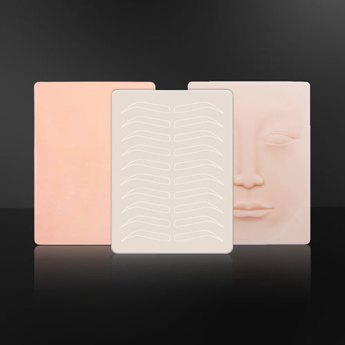
The color chart shows pigment applied to a neutral white surface or a standard test substrate — not skin. Skin has its own color properties (undertone and depth) that change how the pigment color appears after implantation. This is why professional color system design requires testing each color on real skin across the target demographic range — not just verifying the color's appearance in the bottle or on a swatch card.
A professionally designed color system accounts for this by organizing colors into undertone families (cool, warm, neutral) and calibrating each family against the expected skin filter effects for each undertone category. When this systematic calibration is absent, clients get unexpected results — and artists get complaints.
The Pigment Matrix Architecture: Why "More Colors" Is Not the Same as "Better System"
The Three-Layer Structure of a Professional Color System
A professional color system is organized in three functional layers — each serving a different professional need:
Layer 1: Core Primary Colors
The primary color layer covers the fundamental color needs for the most common procedures — brow, lip, and eye. For each zone:
- Brow core colors: Typically 6–12 colors spanning cool and warm undertone families across the light/medium/deep range. This is the palette that handles 80–90% of standard brow procedures without requiring special adaptation.
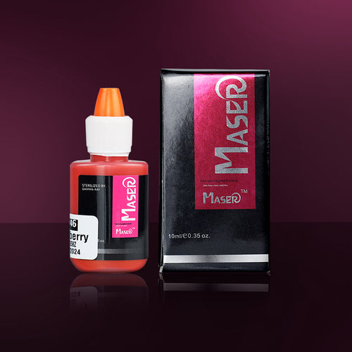
- Lip core colors: Typically 6–12 colors covering the full undertone range from natural pinks and roses to more saturated corals and reds. This is the palette for standard lip enhancement procedures.
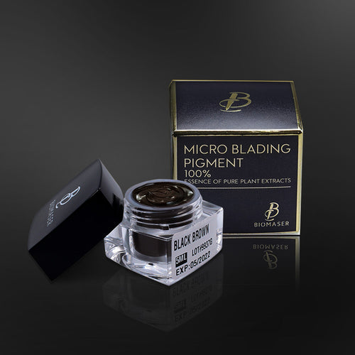
- Eye core colors: Typically 3–5 colors from soft dark brown through warm black, calibrated for the specific intensity requirements of the periorbital zone.
Layer 2: Correction and Neutralization Colors
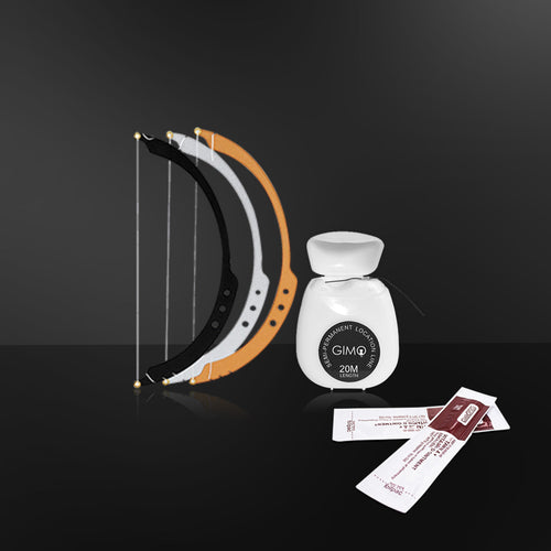
The correction layer exists for the procedures that aren't standard — lips with purple base color, brows that have gone warm after a previous procedure, skin tones that don't fit cleanly into the core palette. Correction colors typically include:
- Pearl white or nude pink: For neutralizing purple/grey base in lips before applying target color
- Cool ash tones: For correcting warm-toned results in brows that have shifted during healing
- Warm correction tones: For adjusting cool-toned results that have gone ashy
Without a dedicated correction layer, artists face the choice of either working around the problem with suboptimal core colors or turning away clients with correction needs. The correction layer is what makes a color system complete enough to handle the full range of professional work.
Layer 3: Specialized Application Colors
The specialized layer covers procedures that require specific color formulations outside the standard palette — SMP scalp micropigmentation (requires specific pigmentation for scalp skin), extremely deep skin tones (requires colors calibrated for the specific undertone and depth interaction), and other specialized applications. Typically 2–4 colors that serve niche but professionally important needs.
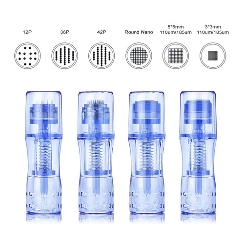
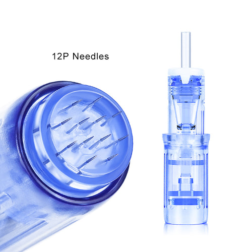
The Six Form Types: Why Delivery Format Is Part of the System
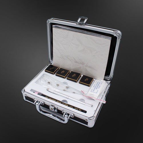
Professional pigment lines offer multiple form types — different physical textures that affect how the pigment behaves during application. A system that only offers one or two forms is incomplete, because different techniques and different skin types benefit from different delivery formats.
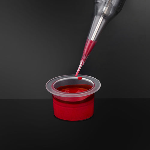
- Powder: Maximum precision for fine-line work — for experienced technicians who want the finest possible pigment control. Requires careful dilution and mixing.
- Cream: Higher pigment loading per unit volume — for clients with normal to oily skin where additional coverage is beneficial. Good balance of saturation and workability.
- Liquid: Fast application and smooth flow — for high-volume sessions where efficiency matters. Lower saturation per pass but faster coverage.
- Gel: High viscosity with good adhesion — for lip and eyeliner work where the pigment needs to stay in place during application.
- Oil-based: Deep penetration characteristics — for dry or mature skin, or for deep correction work.
- Concentrate: Maximum pigment loading in minimum volume — for specialized correction applications or technicians who want maximum control over dosing.
A color system that only offers cream format has optimized for one technique and one skin type — leaving artists working with suboptimal tools for any procedure that benefits from a different form. Professional inventory should include at least four of the six form types to handle the full range of applications.
The Three Things That Determine Whether a Color System Is Professional — Not Just Large
Three evaluation criteria that separate a professional color system from a large color collection:
1. Systematic undertone coverage: Does the system have cool, warm, and neutral undertone families for each zone — not just "a brown" but specifically calibrated cool browns, warm browns, and neutral browns? If the system only offers one brown family, it's not systematic — it's just large.
2. Correction layer completeness: Does the system have neutralization colors for the most common correction scenarios (purple/grey lip base, warm brow shift, cool brow ashiness)? Without correction colors, the system cannot handle the full range of professional work — it can only handle ideal-case standard procedures.
3. Batch stability documentation: Can the manufacturer provide ΔE (color difference) values for each batch compared to the standard reference? A system with 40 colors that vary significantly between batches is less professional than a system with 20 colors that maintains tight consistency batch after batch. Batch stability is the of the entire system — without it, the systematic color logic falls apart when the actual product doesn't match the design specification.
Regional Market Adaptation: The ADS Framework
Why a "Global" Color Line Cannot Actually Serve All Global Markets
The assumption that a single color line can serve all global markets is understandable — it treats color as a universal property that translates directly across populations. The assumption is wrong because skin undertone and aesthetic preference vary significantly across regional demographics in ways that directly affect how PMU colors read.
A color family that produces natural, harmonious results on Northern European cool-pink skin will produce obviously wrong results on Southeast Asian warm-neutral skin — not because the color is bad, but because the skin's color filter properties are fundamentally different. The same is true for the warm-toned palettes that work beautifully on Middle Eastern deep warm-red skin when evaluated against Northern European cool-pink skin.
ADS (Area-based Dermal Shade) frameworks address this by organizing color systems around regional demographic calibration — not just "light/medium/deep" but specifically calibrated for the characteristic undertone and aesthetic preferences of major regional markets.
The Four Principal Regional Calibration Frameworks
European Cool-Pink Calibration:
Characterized by neutral to cool undertone with pink or rose base. The characteristic skin filter effect makes warm-toned colors appear more orange and saturated colors appear more intense than they would on neutral skin. European calibration typically features:
- Cool-toned brow colors (ash blonde, cool taupe, cool medium brown)
- Soft rose and cool pink lip colors that balance the natural pink in the skin rather than competing with it
- Cool dark grey-brown eye colors for natural enhancement without high contrast
North American Warm-Neutral Calibration:
Characterized by wide undertone range from cool to warm with no single dominant undertone. North American clients often have mixed or neutral undertones that accept a broader range of color directions. Calibration typically features:
- Both warm and cool brow options with moderate saturation to serve the widest range
- Warm coral and cool rose lip options with medium chroma for natural-to-enhanced range
- Warm black and cool dark brown eye colors spanning the undertone range
Southeast Asian Warm-Neutral Calibration:
Characterized by warm undertone with yellow or golden base, typically medium depth. The warm skin filter makes cool colors appear ashy and muted. Southeast Asian calibration typically features:
- Warm golden brown and warm chocolate brow colors that complement rather than compete with the warm undertone
- Warm coral and warm pink lip colors with moderate saturation calibrated for the depth range
- Warm dark brown eye colors rather than cool black tones
Middle Eastern Deep Warm-Red Calibration:
Characterized by deep warm undertone with significant red or auburn base. The high depth and warm undertone require colors with sufficient saturation to be visible without appearing ashy or disconnected. Middle Eastern calibration typically features:
- Dark warm brown to black brow colors for strong depth contrast on deep skin
- Deep warm reds, berries, and plum lip colors that complement the warm undertone rather than fighting it
- Deep warm black-brown eye colors for strong definition that reads as natural rather than harsh
The practical implication for artists: if your client base spans multiple regional demographics, a single color line calibrated for one region will produce systematically wrong results on clients from other regions. ADS-calibrated systems solve this by providing regionally specific color families — so the same brand can serve diverse demographics with colors that are actually calibrated for those skin types, not just "a wider range" of colors without systematic regional logic.
Formulation Engineering: The Quality Dimension Beneath the Color System
The Core Tension: Immediate Color vs. Long-Term Stability
Pigment formulation engineering faces a fundamental tension: the color must be active enough to be visible immediately after implantation, but stable enough to remain the intended color for 12–18 months without migrating, fading unevenly, or shifting tone. These two requirements pull in opposite directions — overly active formulations fade and shift; overly stable formulations don't show well initially.
Professional formulation engineering resolves this tension through precise control of:
- Pigment particle size and distribution: Particles in the 0.020μm range are small enough to integrate stably in the dermal matrix but large enough to resist metabolic clearance — producing the balance between immediate visibility and long-term retention
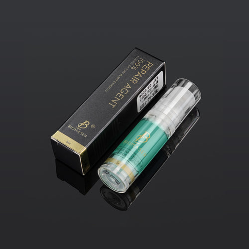
- Carrier system design: The solvent and emulsifier system must protect pigment molecules from oxidation and premature metabolism while allowing them to release predictably during implantation
- pH calibration: The formulation's pH affects how the pigment interacts with the skin's biology — professional formulations are pH-calibrated for the specific tissue environment of each zone (lip mucosa vs. facial skin vs. scalp)
Quality Control as the Determinant of System Longevity
The most professionally designed color system is only as reliable as the quality control system that maintains it batch after batch. A professional QC system for a color system includes:
- Raw material color strength verification: Each batch of raw material is tested against the color specification before use — ensuring that the pigment concentration in the final product matches the design intent
- Trial batch validation: Any formulation adjustment or new color introduction requires trial batch verification against the standard before mass production
- Batch ΔE monitoring: Every production batch is tested for color difference from the standard reference — with documented acceptance criteria (typically ΔE < 1.0 for professional systems)
- Finished goods: Each batch's sample is retained — creating a complete reference archive that allows any historical batch to be compared against current production
Without these QC controls, a color system will gradually drift — batches will become less consistent, colors will begin to deviate from their design specifications, and artists who have developed reliable technique parameters for specific colors will find that those parameters no longer produce the expected results. The QC system is what keeps the color system trustworthy over time.
Evaluating a Color System: The Five-Question Professional Assessment
1. Does the system have dedicated correction and neutralization colors — or only primary colors?
A system with only primary colors will be unable to handle correction procedures. If you frequently encounter clients with problem lips (purple, grey, rose base) or previously worked brows that have shifted tone, a system without a correction layer will create professional limitations.
2. Does the system offer multiple form types (at least four of the six standard forms)?
Form type affects technique compatibility. A system that only offers cream format is optimized for specific techniques and skin types — limiting your ability to work optimally across different procedures and client conditions.
3. Can the supplier provide batch ΔE data confirming color consistency across multiple production batches?
If they can't, the quality system isn't producing the documentation that confirms batch consistency — which means the color system may be drifting from its design specifications in ways that will affect your technique reliability over time.
4. Does the system have undertone families (cool/warm/neutral) organized for your specific client demographic — or just "a range of browns"?
A system with multiple browns but no systematic undertone organization will require you to rely on intuition rather than systematic logic. A professionally organized system makes undertone selection predictable based on client assessment, not guesswork.
5. Has the system been tested on real skin across the demographic range it claims to serve — or only on color charts and swatch cards?
Color on a chart is not the same as color in skin. A system that hasn't been verified against real skin across its target demographic may produce systematic unexpected results that aren't apparent until the client sees the healed result.
FAQ
Is a color system with more colors always better than a smaller one?
No. A system with 40 colors that lack systematic undertone organization and correction layer coverage is less professionally useful than a system with 20 colors that has complete undertone families, a dedicated correction layer, and documented batch stability. The evaluation criteria are systematic organization, coverage completeness, and batch consistency — not raw color count. A smaller but systematically organized system will produce more predictable professional results than a larger but logically unstructured collection.
My color supplier doesn't have correction colors — can I use primary colors to achieve correction results?
Partial correction is possible in some cases — light primary colors can provide limited neutralization for mild base color issues. But primary colors are not formulated for neutralization work; their chroma, undertone calibration, and concentration are designed for primary application, not base correction. Attempting to use primary colors as substitutes for correction colors typically produces suboptimal results: the neutralization effect is weaker than what dedicated correction colors achieve, and the primary color's undertone may conflict with the correction goal. If your supplier lacks correction colors, this represents a systematic gap in their color system — consider whether a supplier with a complete three-layer system would better serve your professional needs.
Why do some colors in my system look different between batches even though they're the same color name?
Batch color variation at the same brand indicates that the quality control system isn't maintaining tight enough tolerances on the production process. The root causes are typically: imprecise raw material dosing between batches, inadequate process parameter control during manufacturing, or insufficient finished goods testing that should catch deviation before shipping. This is a QC system problem, not a formulation problem. If you observe consistent batch variation with a supplier, ask them for their batch ΔE data — if they can't provide it or the values are outside acceptable ranges (ΔE > 1.0 for professional systems), that's an indication the production quality system isn't operating at professional standard. Consider raising this directly with the supplier or evaluating alternative suppliers.
Should I build my inventory around one brand's complete system or mix brands for different color families?
The answer depends on whether any single brand offers a complete system for your client demographic. If one brand has a complete three-layer system (primary + correction + specialized) with full undertone coverage for your demographic and documented batch stability, building around that brand is the most efficient approach — consistent QC, consistent delivery, simplified inventory management. If no single brand offers a complete system for your demographic, mixing brands for specific color families (e.g., one brand for brow primary colors, another brand for lip correction colors) is a reasonable strategy — but it requires you to manage the different batch characteristics and potentially different behavior in use between brands. The ideal is one complete system; the minimum viable is a systematically organized mix.
How do I evaluate whether a color system is properly calibrated for my specific regional client base?
Ask the supplier for documentation of how their color families were developed and tested — specifically, whether the calibration was based on real skin testing across the demographic range they claim to serve. A professional ADS-calibrated system should be able to explain which regional demographic each color family is calibrated for and how the calibration was verified. If the supplier can't explain the regional logic behind their color organization, the system may have been designed for a different demographic and applied globally without proper adaptation testing. Request this documentation before committing to a large inventory purchase.
Key Takeaways
- A professional color system is a structured engineering system with three functional layers (primary, correction, specialized) and six form types — not a collection of colors sorted by visual similarity
- Color in the bottle or on a swatch chart is not the same as color in the skin — the skin's undertone acts as a color filter that shifts the apparent result, which is why professional color system design requires skin-based calibration testing, not just chart-based color selection
- The three dimensions of color (hue, value, chroma) interact with the skin to produce results that require systematic undertone calibration — cool undertone families, warm undertone families, and neutral undertone families are not optional variations but structural requirements for reliable professional results
- The ADS regional adaptation framework addresses the reality that a single color line cannot serve all global markets — different regional populations have characteristic undertone and depth profiles that require specifically calibrated color families
- Batch stability is the foundational quality attribute of a color system — without documented ΔE monitoring and batch-level QC, even the most systematically organized color system will drift from its design specifications over time
- The five-question professional assessment (correction layer, form types, batch ΔE data, undertone families, skin-based calibration) separates a professional color system from a large color collection before you commit to an inventory investment